Aisle Five Has Jokes: The Accidental Stand-Up Comedy of Grocery Store Signs
There is a Kroger somewhere in the American midwest with a handwritten sign above the banana display that reads FRESH BANNANA'S — 3 FOR $1!! And that sign — with its rogue apostrophe, its creative spelling, and its unearned enthusiasm — is funnier than most things currently streaming on Netflix.
We don't talk enough about grocery store signage as a comedic art form. Not because it isn't worthy of discussion, but because we're usually too busy trying to figure out if the "2 for $5" deal requires us to actually buy two things. (It doesn't. But you'll buy two anyway. We all do.)
The humble handwritten price tag is America's most democratic form of humor. No writer's room. No focus group. Just a Sharpie, a piece of cardboard, and someone named Gary who has been on shift since six in the morning.
The Apostrophe: Public Enemy Number One
If you want to understand the soul of grocery store comedy, you must first make peace with the apostrophe situation. It is, to put it diplomatically, dire.
Possessive apostrophes appear where they have no business existing. Plural nouns become inexplicably possessive. Tomatoes become TOMATO'S. Deals become DEAL'S OF THE WEEK. At a certain point, you start to wonder if the apostrophe isn't a punctuation mark so much as a decorative flourish — like a little hat the letters get to wear on special occasions.
Grammar pedants have been losing their minds over this for decades. The rest of us have been quietly, gleefully entertained. There's a whole Instagram account dedicated exclusively to apostrophe crimes in retail signage, and it has more engaged followers than most mid-tier celebrities. That tells you everything.
The rogue apostrophe isn't just a typo. It's a vibe. It says: someone was working fast, probably underpaid, possibly running on gas station coffee, and they made a choice. That choice has now been photographed by forty-seven different customers and posted to Reddit's r/mildlyinfuriating, where it will live forever.
ALL CAPS AND THE ART OF AGGRESSIVE Produce Marketing
If apostrophes are the grammar villain of grocery store signage, then ALL CAPS is its unhinged cousin who shows up to Thanksgiving and immediately starts an argument.
Somewhere along the line, produce departments decided that the only way to move inventory was through sheer typographic intimidation. You don't see a polite suggestion to try the peaches. You see FRESH GEORGIA PEACHES — GET THEM NOW BEFORE THEY'RE GONE!!! Three exclamation points. Underlined. Written in red marker thick enough to be visible from the parking lot.
The urgency is staggering. The peaches are not going to last, people. This is not a drill. The peaches will not wait for you to finish deliberating over whether you want the kind with the fuzzy skin or the slightly less fuzzy skin. THE PEACHES HAVE PLACES TO BE.
There's something deeply funny about produce being marketed with the same energy as a limited-time sneaker drop. Nobody is camping outside Whole Foods overnight for heirloom tomatoes. And yet, based on the signage, perhaps they should be.
The "Sale" vs. "Sail" Cinematic Universe
Let's talk about the homophone problem, which is less common but infinitely more rewarding when it surfaces.
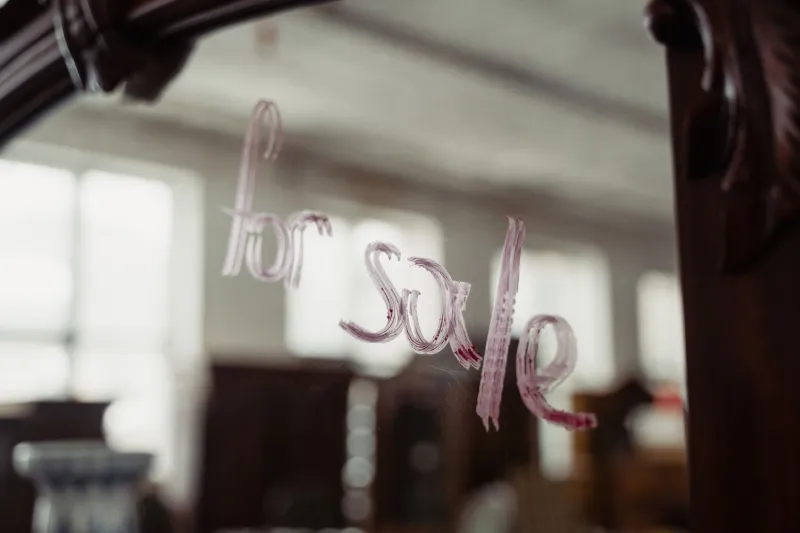
Somewhere out there — and yes, this has been documented — a grocery store sign has advertised a SAIL ON ALL FROZEN GOODS. Which raises the immediate and delightful question: where are these frozen goods going? What vessel are they departing on? Can I come?
The sale/sail confusion is the crown jewel of accidental grocery store poetry. It transforms a mundane discount announcement into something almost nautical. Almost romantic. You came in for a bag of tater tots and you left with a vision of fish sticks drifting out to sea on a great commercial voyage.
Spelling errors in general tend to hit different on handwritten signs because there's no autocorrect safety net. It's raw. It's human. A digital sign that says SPAGETTI is a software failure. A handwritten sign that says SPAGETTI is a window into the soul.
Font Choices That Simply Cannot Be Explained
The handwritten sign is one beast, but let's not sleep on the printed grocery store sign — specifically the ones produced on an office inkjet printer using a font selection that suggests the designer had access to every typeface ever created and chose to use six of them simultaneously.
Comic Sans for the header. Times New Roman for the price. A clip art graphic of a smiling sun. WordArt that has been stretched to fill the page in a way that makes the letters look vaguely panicked. All of this surrounded by a clip art border of little dancing vegetables that were last updated in 1997.
This is not a criticism. This is a love letter. These signs represent a particular strain of American DIY energy that is completely unself-conscious and therefore completely charming. Whoever made that sign was not trying to win a design award. They were trying to let you know that the rotisserie chicken is now $6.99 and available after 11 a.m. They had a mission. Font choice was not part of the mission.
Why We Actually Love This
Here's the thing nobody says out loud: in an era of hyper-polished digital marketing, algorithmic content, and brand voices that have been workshopped to death by committee, the handwritten grocery store sign is refreshing.
It's imperfect. It's immediate. It was made by a human being who had a piece of cardboard and something to say about the price of cantaloupe. There's no A/B testing. There's no brand consistency audit. There's just ink and intention and the occasional grammatical catastrophe.
The internet has turned these signs into a genre. People photograph them, share them, and collect them the way previous generations collected baseball cards — except instead of Hank Aaron, you're trading a photo of a sign that says SEEDLESS GRAPE'S — VERY DELICOUS and everyone in the group chat loses it.
It's comedy that nobody manufactured. It loaded all by itself, right there between the deli counter and the discount bread rack.
The Legacy of the Sharpie Sign
So the next time you're wandering the aisles of your local grocery store and you spot a handwritten sign with a spelling that doesn't quite work, an apostrophe in a place God never intended, or an all-caps declaration about the urgency of buying more yogurt — stop. Take a breath. Take a photo.
You are looking at an accidental masterpiece. A tiny, unintentional joke made by someone who was just trying to do their job. The fact that it's funny is completely beside the point. The fact that it's this funny is a gift.
Grocery stores didn't set out to be comedy venues. They just ended up that way, one misspelled sale sign at a time.
And honestly? That's the funniest part of all.